Integration API Visualiser
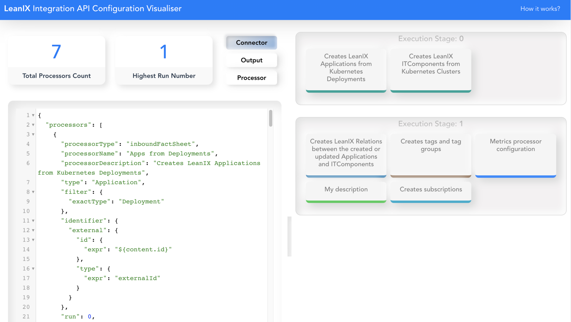
Integration API Visualiser is an experimental project to demonstrate an alternative UI for Integration API. The goals of the experiment is to improve readability of large, complex Integration API processors
TL;DR
We at LeanIX take pride in our top-of-class user experience of our products. The only way to achieve the best user experience for our customers is through multiple design sprints and iterations. In this blog, I would like to share a journey of our internal experimental projects. Our aim is to showcase the innovation and leadership culture at LeanIX.
"Leadership is not a designation, but a characteristic"
Check out the visualizer here!
Introduction
The Integration API is a declarative API of LeanIX which provides a powerful way to import and export data, with support for our dynamic data model, built-in "create or update" support, scheduling & logging capabilities, and more. It is used across the board for creating connectors, both from LeanIX customers and for built-in integrations with AWS or Apptio. It's continuously extended by our product team, see e.g. this live session from our conference last year.
I was first involved in implementing Integration API processors during implementation of a connector for the "Microservice Intelligence" product.
Inception
I work with advanced concepts in Integration API like variables, deletion scope etc, though Integration API is great at solving complex and difficult integrations, the power comes with a price. As a first-hand user, I identified new feature requests to improve readability of complex processors. Instead of following the hamster wheel and waiting for advancement on the product roadmap, we decided to innovate on the job - to make our life more fun & simple, and eventually feed to the core product.
I couldn't start right away until I met other passionate colleagues! Meet the Team,
We brainstormed and came up with following features set,
- Visualise individual processors
- Group processors based on run number; To easily understand what happens when
- Finding and editing a processor
- Have a bigger editor area to work on a processor
- Parsing the Integration API run output for errors on each processor
To get the team completely onboarded with the idea I implemented a quick prototype to showcase the basic working of the features. This helped Pavan to understand the vision and quickly come up with some initial design iterations.
Team's Comments
Shravya: If you are working at LeanIX, then it is likely that you work on Integration API at least once (if not only more than once) in a day. When Aravind said he wants to enhance the experience using this visualizer, I was instantly excited to contribute. Initially, we concentrated only on basic feature sets. Later we even came up with the feature to track errors for each processor, which I believed will add more value
Pavan: As soon as Aravind reached out to me with the idea, I was excited since it now challenges me to focus on the developer experience
Technical choices
We picked Vue.js as the main frontend framework of choice. Building the visualiser with Vue.js was fun and productive. The size and boilerplate of the project is optimal. Second, in-build reactive property binding worked really well in our case. For example, In the visualiser, as soon as you paste the Integration API processors in the editor the UI on right side is rendered without a sigle click!
Collaboration
Initially, we planned to split the tasks and work individually, but it did not work out for us. So we quickly shifted to the pair programming style of development. We picked a certain set of features to implement together. This turned out to be more fun especially in work-from-home scenario.
The complete team occasionally used to catch up on a Friday evening to talk about the progress. However, most of the communication happened over Slack.
Team's Comments
Shravya: I believe every developer goes through a phase where they have ideas but due to various reasons they never actually become projects. We all need someone/ something to push us during those initial days, give us motivation to start/ complete writing that piece of code.
I needed that as well, working with Aravind was enjoyable and productive.
Design
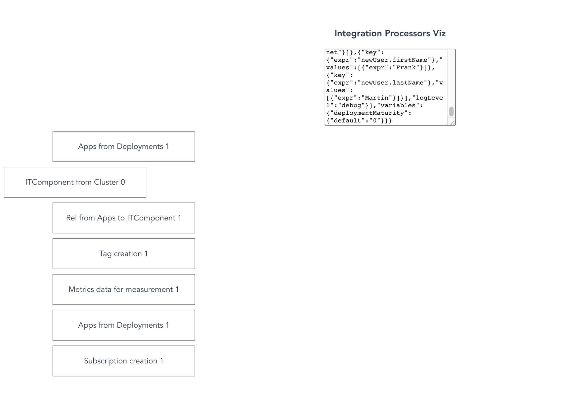
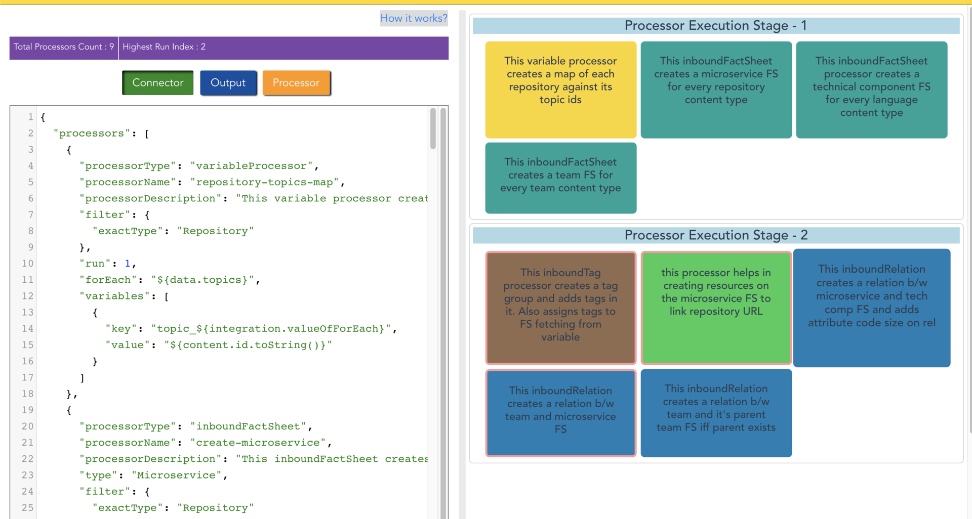
I could not come up with a great-looking UI (Take a look at the prototype below)! Looking back at the first versions it is night and day difference now. Pavan was great at picking our brains. It helped us to get more concrete understanding of a feature as well.
First design iterations were not great. One of the main reasons is, we were totally focussed on completing the functionality. As we moved towards completion of features we got more clarity and finally, Pavan came up with a cool-looking UI/UX that we have currently.
First Prototype


Team's Comments
Pavan: When designing for developers, I wanted the design to reflect their real-world experiences. Given that most of their tools use a flat-design approach, moving toward a realistic and affordance-rich interface made sense. 'Neuomorphism' was a great fit for all our criteria, and it is also kinda cool to look at 😎
Surprising feedback
When we first started development, we thought this will be a great tool for developers and other teams but, after we showcased it our team, we got positive responses from the sales teams as well. Which was quite a surprise. Later it clicked that technically inclined customers who work with Integration API could take the help of this tool to get a bird's eye view of the processors.
Conclusion
Overall it was a great experience for us to get started with a project from scratch and receive such a positive response and support from our colleagues and leadership.
Team's Comments
Shravya: It was awesome working on this. If you haven't had a chance to take a look at it yet, check it out here.
Let us know what you think!
If you are interested in contributing, feel free to raise a PR here!
Published by Aravind Metku
Visit author page
